






























Brand guide

RATIONALE

Focusing on creatively making space, not on belonging to a brand.

In a world where engagement…

Stuff her about engagement Stuff her about engagement Stuff her about engagement Stuff her about engagement Stuff her about engagement 

Our personality could be one…

Lorem ipsum dolor sit amet, consectetur adipiscing elit. Ut elit tellus, luctus nec ullamcorper mattis, pulvinar dapibus leo.

Lorem ipsum dolor sit amet, consectetur adipiscing elit. Ut elit tellus, luctus nec ullamcorper mattis, pulvinar dapibus leo.

Words, phrases, and big ideas

Stuff and things here and words plus more words. Don’t stop typeing until we have all the words out and everyone is happy with the words. 

Also something about the what and how and some non-sense. Writing is one of my core skills by the way. You should let me write everything and see just how good I am. You will be very impressed.

Key words

Lots and lots of key words in here to take up this space and make is so cool.

What this means creatively and in the way we ‘do’ branded work.

The brand isn’t the star

Instead of talking about the solution, as many other products do, we aim to be a brand devoted to meeting our audience where they are– in their questions, worries, and need. It’s our role to help them see the opportunities, encourage them toward action, and then offer the most easy & tangible solution. It’s their story and we’re just a small part of it.

A diverse library

Stuff and things here and words plus more words. Don’t stop typeing until we have all the words out and everyone is happy with the words. 

Also something about the what and how and some non-sense. Writing is one of my core skills by the way. You should let me write everything and see just how good I am. You will be very impressed.

More about the how than the what

Stuff and things here and words plus more words. Don’t stop typeing until we have all the words out and everyone is happy with the words. 

Also something about the what and how and some non-sense. Writing is one of my core skills by the way. You should let me write everything and see just how good I am. You will be very impressed.

How to use the logo

Logo_uses

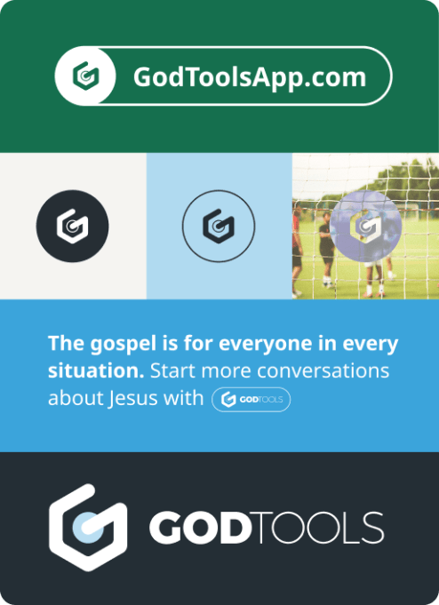
Here are some acceptable and suggested ways to use the GodTools. When using the logo it is important to use backgrounds with a distinct color contrasts, like a light colored logo on a dark colored background or vice versa. The logo can be used The logo can also be used in a filled in circle or an outlined circle. The filled in circle can be changed to adapt to a photo or an illustration. 

Logo variations

Logo_Example10
Logo_Example09
Logo_Example08
Logo_Example07
Logo_Example06
Logo_Example05
Logo_Example04
Logo_Example03
Logo_Example02
Logo_Example01
Logo_Example11
Logo_Example12

How to not use the logo

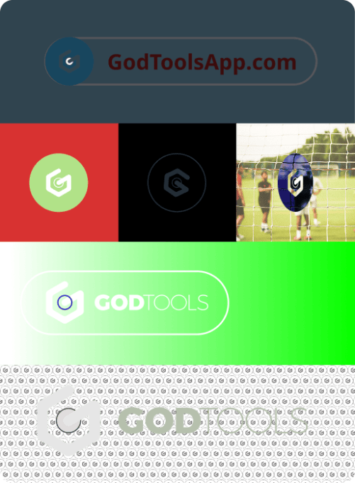
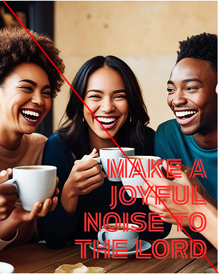
Here are a few examples of how not to use the GodTools logo. As seen in these examples, it is recommended to not rotate, skew, or distort the logo. Do not use the logo on a patterned background that makes it hard to view the logo and logo text clearly. Do not use colors that are too complementary and tend to “vibrate” visually next to each other.

Logo_Bad_example

Clear Space

Logo_ClearSpace1
Logo_ClearSpace3
Logo_ClearSpace2
Logo_ClearSpace4

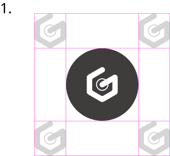
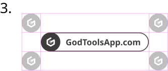
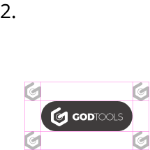
Here are a few examples of how use clear space with the GodTools logo. Clear space ensures visibility and prevents other elements from competing with the logo.

Generally, you can determine the clear space needed for the logo by using the “G” mark as a parameter. As noted in this section, the third example is the exception which uses the circle around the “G” as the clear space parameter.

Alignment & Usage

It is best to align the logo in the the right or left corner, centered on the top or bottom, or another position where the logo is balanced with the rest of the composition. The logo is meant to be a part of the composition but to not stick out too much or draw too much attention.

Additionally, it is important to make sure that the logo is balanced with the rest of the composition and conflicting with other elements.

Logo_Align_1

Core brand fonts

Noto Sans

Bold

Regular

Semibold

Light

Bogart

Light

Regular

Semibold

Bold

TIMELESS & GLOBALLY MINDED

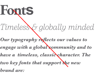
Fonts

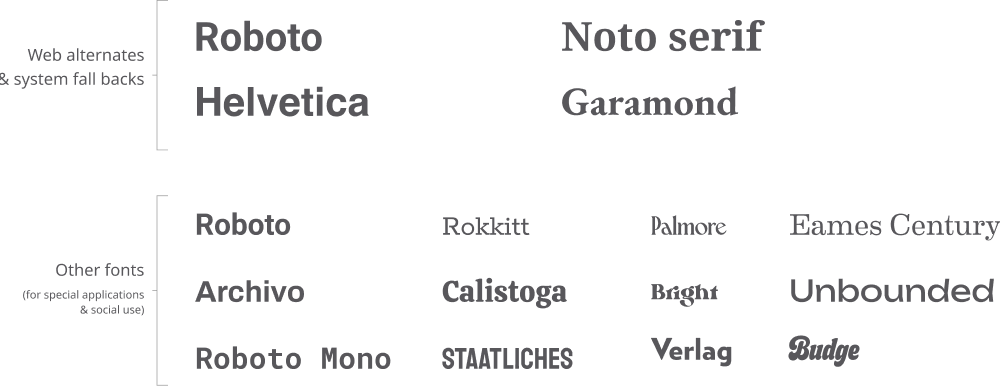
Our typography reflects our values to engage with a global community and to have a timeless, classic character. The two key fonts that support the new brand are:

Noto Sans – a well crafted and established font that supports 800+ languages.

Bogart – a timeless serif font. It serves as a complimentary stylistic choice to contrast and balance the simplicity of Noto Sans.

Typefaces

Type Lock-Ups

Logo_Site
Logo_Name

Here are two type lock-ups for the GodTools logo. The color of the lock-ups can change but please do not change any other aspects of the design

Typeface_lockup

For collaborations with other brands, please use the lock-up above and use this lock-up in either black or white. Also, do not change other aspects of the lock-up. 

Do’s and do not’s

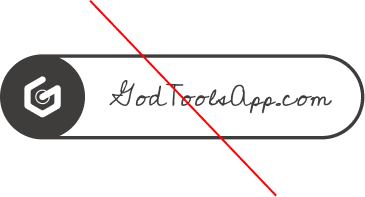
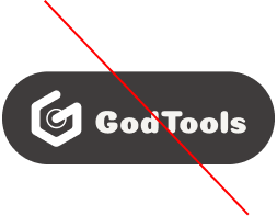
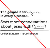
Do not change the fonts in the lock-ups.

LockUp_dont_2
LockUp_dont_3

Do not use multiple fonts flippantly and do not use italic fonts excessively.

LockUp_dont_4
LockUp_dont_5

Do keep the colors consistent in the logo lock-ups.

LockUp_dont_6
LockUp_dont_7

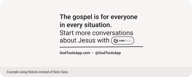
Do make sure there is balance and contrast when using web fonts or other fonts.

LockUp_dont_1

other guidelines

Header 1: Noto Sans

Header 2: Bogart Condensed Regular

Body text: Noto Sans Regular

Noto Sans should always be used as the header font. Bogart is the secondary header font and Noto Sans is usually used as the body text font.

Imagery

Photography, videography, and capturing real world creativity.

How we describe, capture, and depict the world through visual media communicates so much more than what we can say in words.

Why

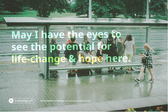
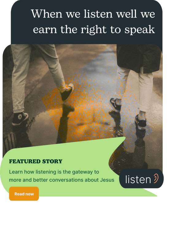
It is from a unique perspective and puts a safe distance for the viewer to see the casualness of the situation without being in the middle of it. The washed out foreground creates depth and forces the viewer to not get stuck in the details.

Core inspiration images

KeyIdeas_image

Key Ideas
For using
PHOTOGRAPHY:

  • We seek to treat photography as art, not as filler.
  • The situation is the subject. Counterintuitive situations, passing glances, and odd-angles help keep our style unique, fresh, and focused on real un-staged life.
  • Grain, texture, and other physical photo treatments are good.
  • We seek to avoid the trap of each stock photo needing to describe or illustrate what the accompanying headline is communicating.
Color_Palette
Color_circles

Color

Hues & shades of daily living

The different hues and shades work together to help give a sense of unity and cohesion. Our brand is also not limited to these colors and can mix and blend with different colors, art styles, and illustrations.

Color_Ramps

Suggested color palettes

Color_Suggested_1
Color_Suggested_2
Color_Suggested_3
Color_Suggested_4
Color_Suggested_5

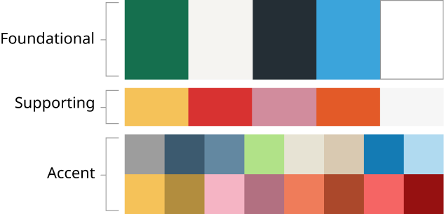
Colors should harmonize with each other and follow the foundational, supporting, and accent hierarchy. For another visual on color hierarchy, look at the circle graphic (the largest circles represent the foundational colors and the smaller circles represent support and accent colors).

Avoid these color palettes

Color_avoid_1
Color_avoid_2
Color_avoid_3
Color_avoid_4
Color_avoid_5

Colors should not clash or look chaotic. The red and orange colors should be used sparingly. Supporting and accent colors should not dominant a composition.

Messaging

Some sample phrases and ideas

The eventual brand book will give a more full picture of what the new GodTools brand might sound like.

Messaging_Example

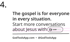
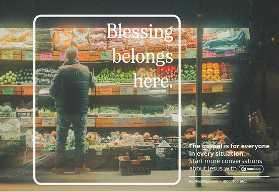
The gospel is for everyone in every situation. Start more conversations about Jesus with GodTools.

Do you believe that Christ didn’t die for you to have surface-level conversations about nothing? Yes, even your simple questions and daily interactions can carry the weight of glory that Christ gave his blood for. You are a new creation– speak like it.

Even your questions can carry a seed of the gospel.

Who in your life needs to hear some good news today? Who needs to know they’re not walking their path alone?

Sharing the gospel isn’t only for pastors, missionaries, and the super-spiritual. You were designed to share.

Find out for yourself on GodTools.

Real conversations about faith are possible.

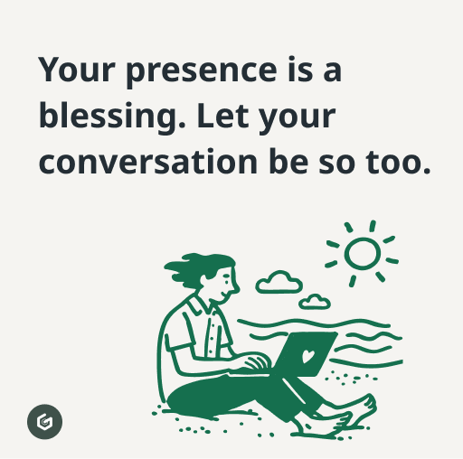
Your presence is a blessing. Let your conversation be so too.

Every person you pass today carries a story you can’t see.

Social Media

Some sample phrases and ideas

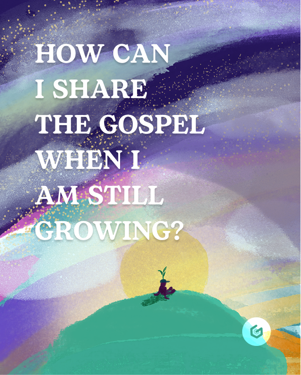
Creative, imaginative, thought-provoking, challenging, and insightful. The creative friend you are never really sure what they are walking out of the closet wearing, but it doesn’t really matter because you know they don’t really care where you’re going. They will make it work no matter what. They always have some way to pull it all together and they are going to show up confidently regardless of how they feel internally.

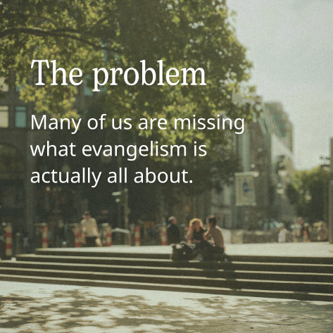
Style is a mindset, not just a feeling. Same with evangelism. You love the gospel, so you walk out of the house secure in God’s love for you and you show up basking in it. Sharing about it feels normal because it’s changed your life and it matters to you. Just like a good movie or a restaurant, when you find something you love, something that has changed you, you want others to be changed by it as well, so you can’t help but tell others. If they don’t want to try, that’s up to them, but you’re never going to stop talking about it.

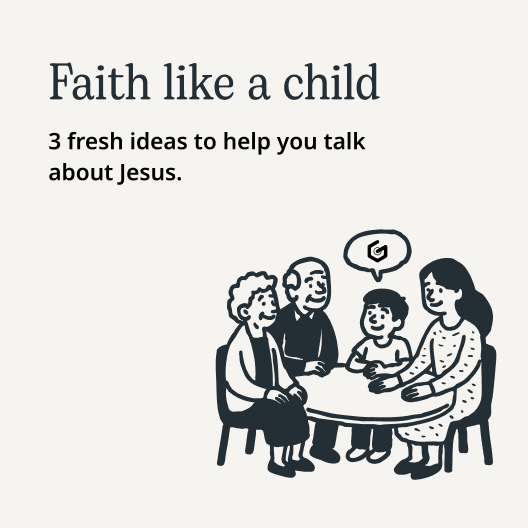
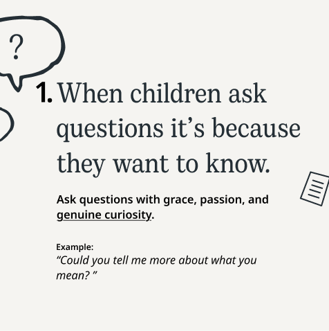
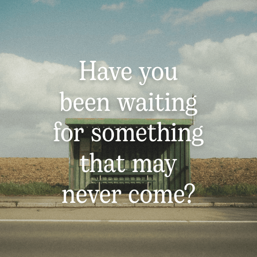
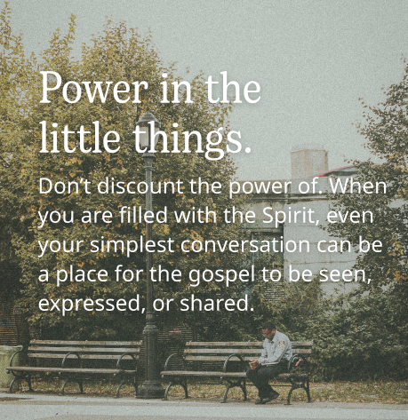
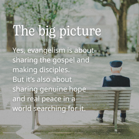
Social_example_1
Social_example_5

Social guiding ideas:

Practical, thought-provoking, encouraging, reminding, nudging, challenging, kick-in-the-booty, convicting, discipling, faithful, wise, aware.

We want to be a faithful friend who is learning alongside you, encouraging you when you get nervous but also pushing you when you are being lazy or fearful.

We want to challenge you to think more, think deeper, and to sit with some stuff.

We don’t want to be blaringly controversial but maybe a little bit of an “uff.”

Our space has fresh insight but also timeless practical advice on how to move forward.

Do’s & Don’ts

This space isn’t for updates. It’s not a place to inform super users of new things. It’s a creative platform for ideas, and tips on how to do evangelism well. It’s a community-building space for growing together, but not in a company way, in a friend way.

  • Don’t slap together Canva posts.
  • Don’t jump on a trend unless it really fits our audience.
  • Don’t be afraid to copy other users’ ideas in the field (10 things we wish we could tell our nonbeliever friends).
  • Don’t overuse one color or font.
  • Don’t get lost in sharing merely about having a relationship with Jesus.


  • Do give “overly” practical advice repetitively.
  • Do collab with more people.
  • Do more video.
  • Do make use of all sides of sharing faith (before, during, after parts of the process).
  • Do focus on evangelism over merely having a relationship with Jesus (sometimes we focus too much on having a relationship with Jesus and not the application of it — i.e., evangelism)
Social_example_10
Social_example_9
zh_CNZH